Game-changing experiences on and off the field
Words: Sam Edwards
Published on April 2, 2024
Huddle is a student sports events and travel company. They exist to elevate the student sporting experience, creating unforgettable and life-changing moments for the participants. These experiences empower students to elevate their game both on and off the field, fostering growth in all aspects of their lives. Each of Huddle’s tournaments takes place in breathtaking venues across the globe, accompanied by elite-level coaches, and international competitors, creating an incomparable festival of sport.
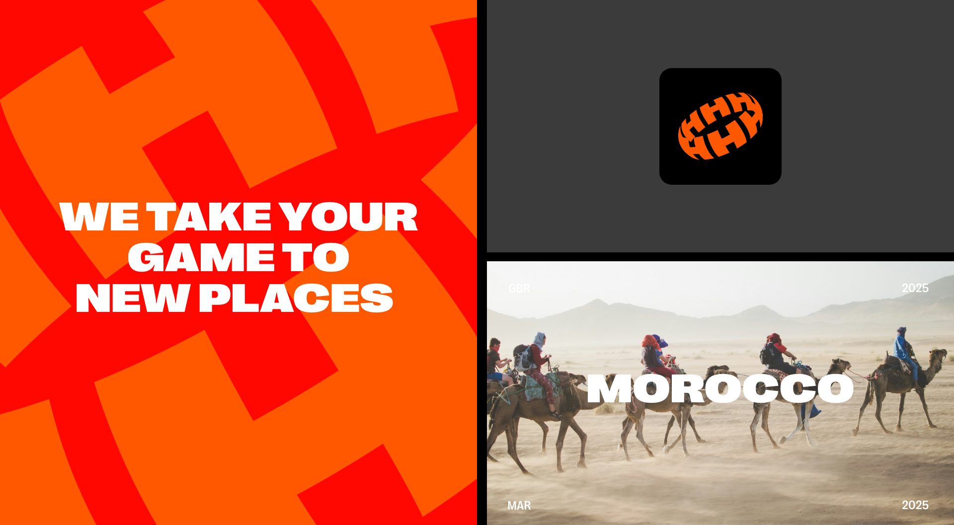
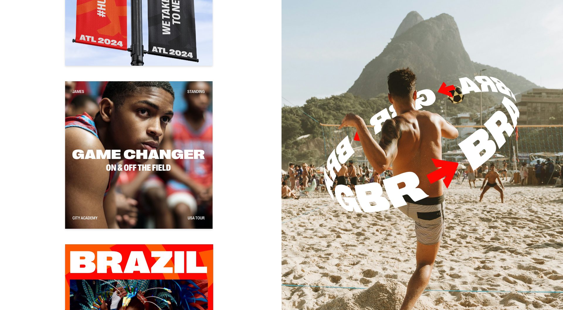
Earlier this year, we were commissioned to create a brand identity that not only celebrates sporting excellence but also highlights the sense of community and togetherness at the core of Huddle’s ethos. The brand mark visually encompasses the name, presenting the core concept of shared experiences. The asset is designed to be flexible, working across the brand world.
PP Right Grotesk was chosen as our primary typeface, blending the functional with a touch of personality – it can be a loud and proud star player or a humble super sub across our communication.
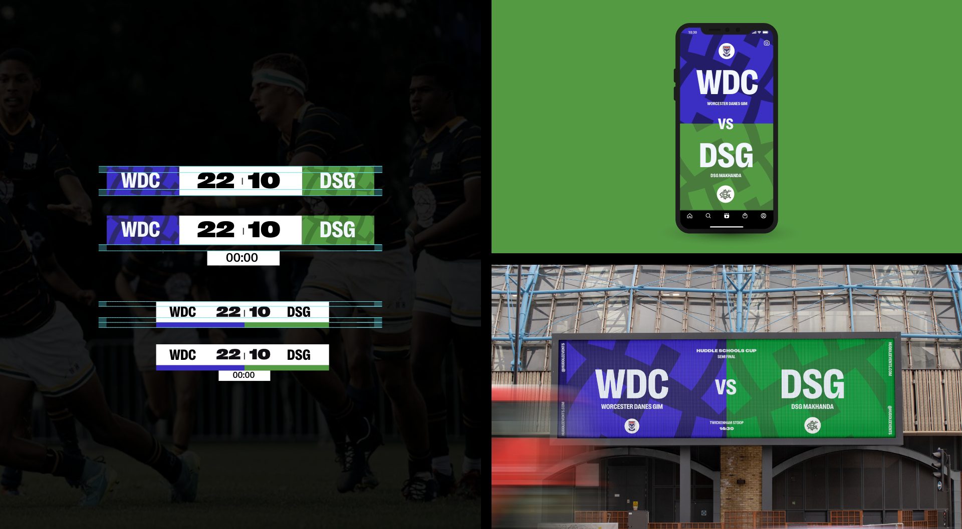
The brand’s primary colorway is designed to work in pairs, giving a feeling of togetherness. The secondary color system can be flexed and adapted to champion the teams, schools, and players without compromise.
Ensuring an equal balance between sporting and travel experiences is pivotal in reinforcing Huddle’s positioning for personal growth on and off the field. Raw, authentic, and vibrant, our art direction places the people and teams in action through purposeful angles and crops.
We are continuing to develop the identity ahead of Huddle’s first events this year – so keep a lookout for the case study.