How do you capture the character of a place in a typeface?
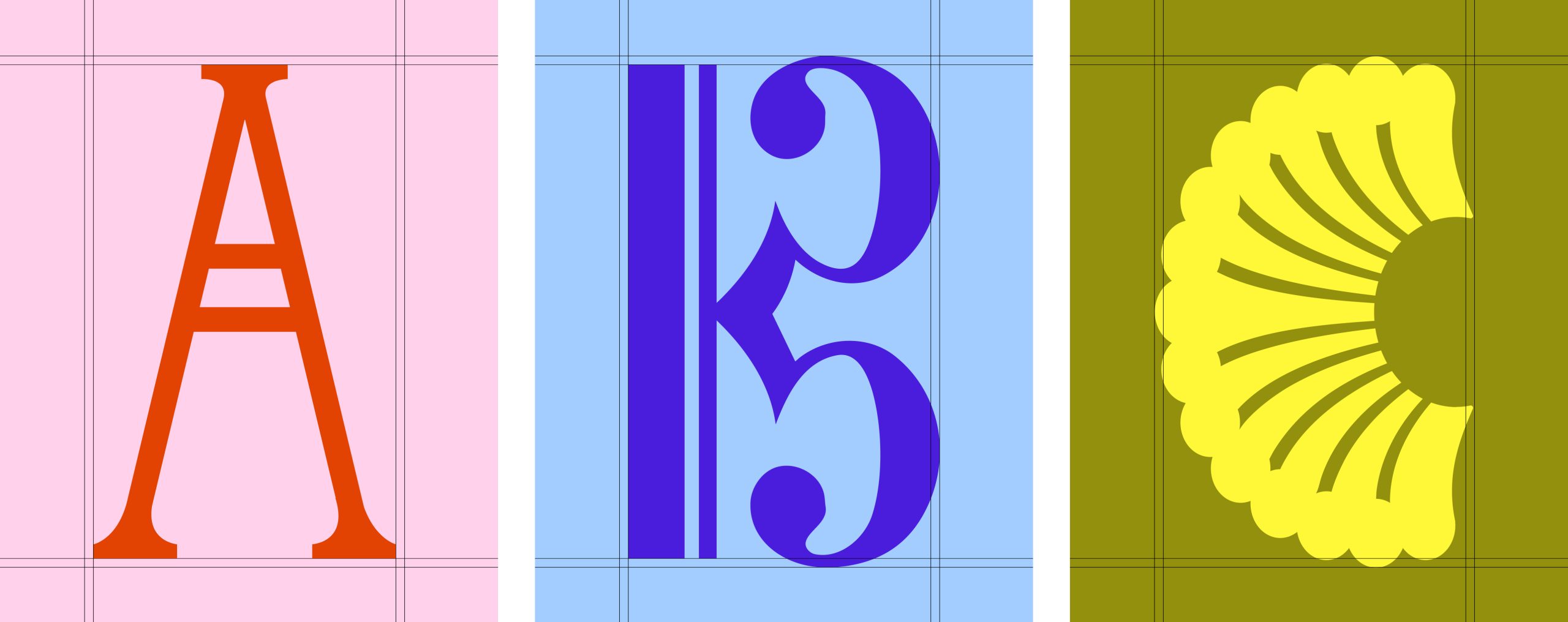
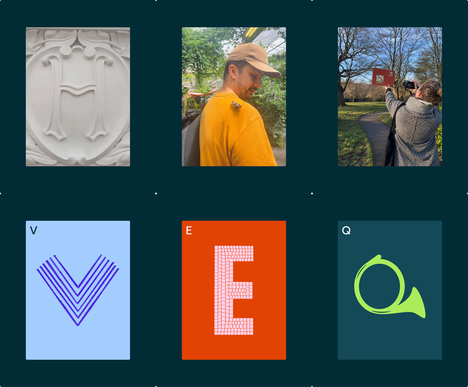
One of our biggest objectives was to build a visual world that reflected the experience of visiting the Horniman. It’s a place that’s wonderfully eclectic, where nature and culture come together in ways found nowhere else in London. It’s the kind of place where you leave having found something you weren’t looking for. We wanted the identity to capture that feeling before you’d even stepped through the door.
The campaign idea ‘It’s in our nature’ is built around that same relationship between nature and culture. Rather than relying on familiar museum tropes or simply filling the identity with objects from the collection, we wanted to create a visual language that expressed the connection itself.
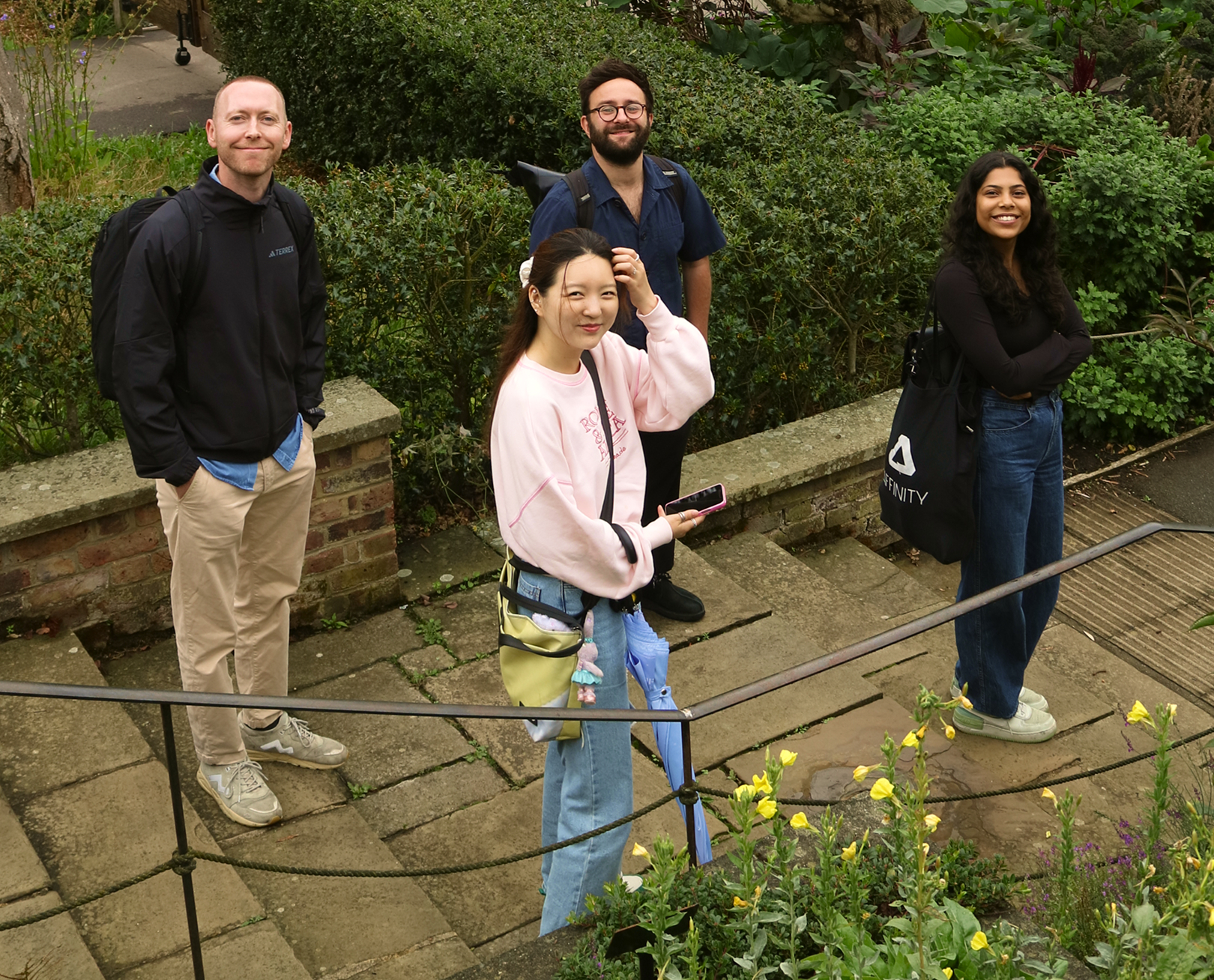
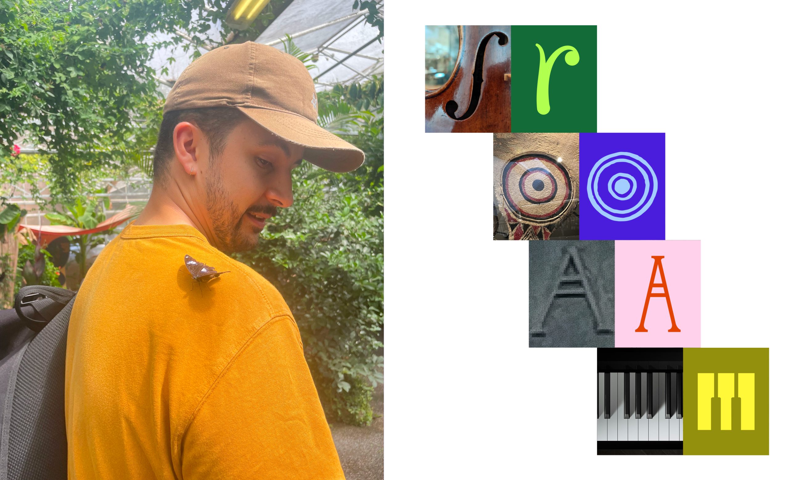
The typeface began with research rather than sketchbooks. As a team we spent time wandering the museum and gardens individually, documenting anything that caught our attention: textures, architectural details, specimens, animals, patterns and unexpected moments. We captured hundreds of photographs instinctively on our phones before we came back together for a second walk, comparing what we’d each noticed and debating why particular details had resonated. That shared process became just as important as the references themselves. We weren’t looking for objects to illustrate; we were trying to uncover the visual DNA of the Horniman and understand what gave the place its distinctive character.
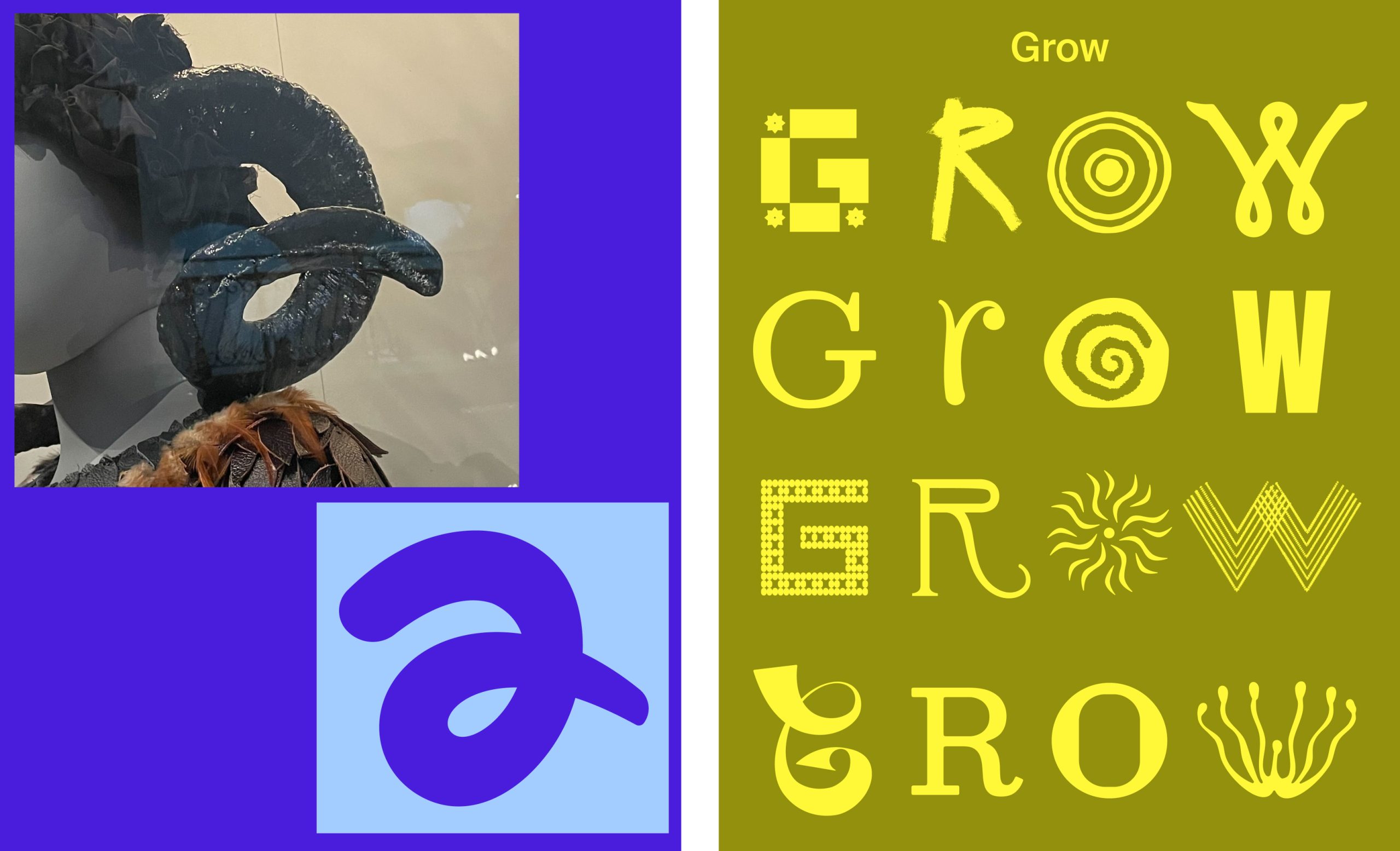
Some references translated almost directly into letterforms, while others became subtler structural ideas informing proportions, terminals or rhythm rather than decoration. Typography is often the first thing people experience before they’ve processed a single word, so we wanted that first impression to feel playful and curious, because those are the emotions the campaign is designed to evoke. At the same time, every letter still needed to perform its primary job: being read effortlessly. The process became an exercise in balance, preserving enough character to make the alphabet unmistakably Horniman, while exercising enough restraint for it to work across everything from OOH to social posts and on-site branding.
One of the things we love most is that the typeface rewards curiosity. Some visitors might recognise a letter inspired by the bandstand, the horn of a sculpture or a familiar pattern they’ve spotted in the galleries or gardens. These become small Easter egg moments that encourage people to look a little closer. Not every reference needs to be recognised, but collectively they create a visual language that feels authentically Horniman.
We also wanted the alphabet to stay open-ended, so it can continue to grow through contributions from schools, volunteers and community groups, evolving alongside the Horniman itself.
In many ways, the typeface behaves like a visit to the Horniman: the more closely you look, the more connections you begin to make.
Read more
Campaign features Horniman Museum & Gardens
Campaign features Horniman Museum & Gardens
BP&O features Horniman Museum & Gardens
‘I am the walrus’: Anatomy’s charming new identity for the Horniman
Anatomy joins GWR agency roster
The appointment comes at a pivotal moment for Great Western Railway, as it prepares to enter public ownership and navigate one of the most significant periods of change in its recent history.